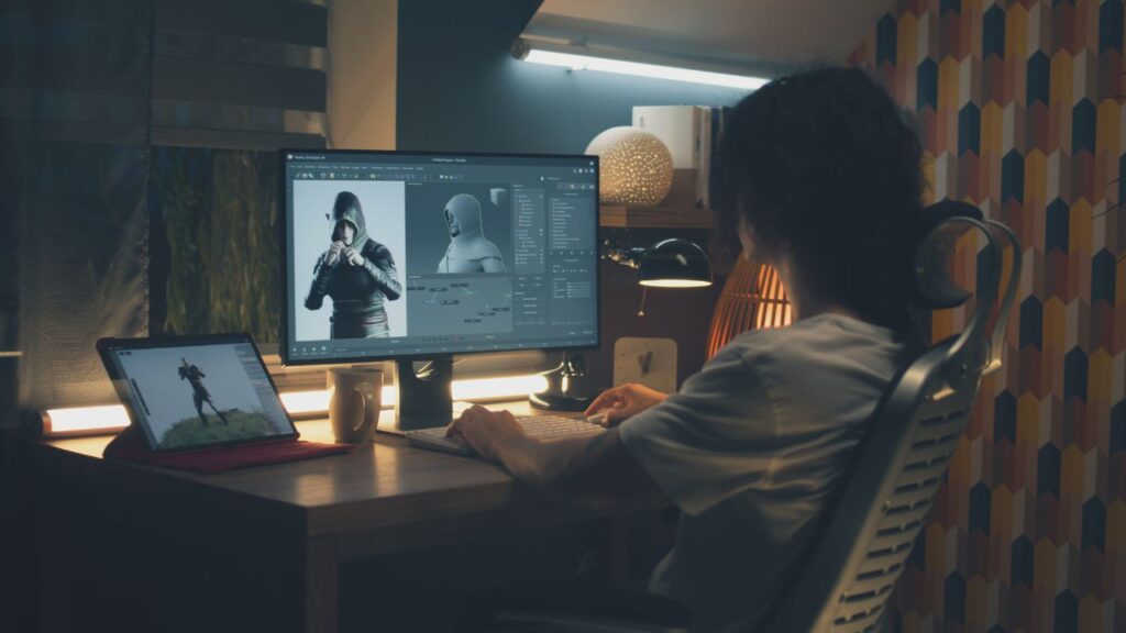
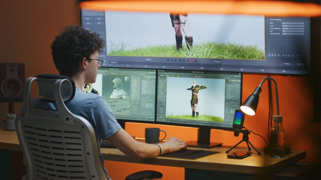
Creating characters that stick in people’s minds can feel like an impossible task. Many artists struggle to move beyond basic drawings and create characters that truly connect with viewers. The difference between a forgettable sketch and an iconic character lies in understanding the core building blocks of character design.
Character design combines visual elements like silhouette, color, and personality traits to create memorable figures that tell a story at first glance. When artists master these fundamentals, they can bring any character to life, whether for animation, games, or comics. The process involves more than just drawing skills.
Learning the essential principles behind great character design helps artists develop their own unique style. By focusing on key elements and proven techniques, anyone can create characters that grab attention and leave lasting impressions. The journey from basic sketches to compelling characters starts with understanding these core concepts.
What Makes a Character Design Actually Work?
Good character design depends on three main elements that work together to create memorable and effective characters. Strong silhouettes help characters stand out, smart color choices convey personality and mood, and proper proportions bring believability to any design style.
How Does Silhouette Impact Character Recognition?
The silhouette is the most important part of character design. A character should be recognizable even when shown as a black shape against a white background.
Strong silhouettes use clear, simple shapes that avoid confusion. Characters with good silhouettes have distinct poses and body shapes that tell viewers about their personality right away.
Shape language plays a big role here. Round shapes suggest friendliness and softness. Sharp, angular shapes communicate danger or aggression. Squares and rectangles show stability and strength.
Disney characters work well because of their strong silhouettes. Mickey Mouse’s round ears and body make him instantly recognizable. Maleficent’s tall, pointed design shows her villainous nature without words.
Test your character by filling it with solid black. If you can still tell what kind of character it is, the silhouette works. If not, the design needs more work.
Why Do Color Choices Matter So Much?
Color does more than make characters look pretty. It communicates personality, mood, and story information to viewers before they know anything else about the character.
Warm colors like red, orange, and yellow suggest energy, friendliness, or aggression. Cool colors like blue, green, and purple often show calmness, sadness, or mystery.
Heroes often wear bright, primary colors. Villains typically use darker shades or harsh color combinations. This isn’t a rule, but it’s a pattern that helps audiences understand characters quickly.
Color palettes should stay simple. Too many colors make characters look messy and hard to remember. Most successful characters use three to five main colors.
Think about how colors work together. Complementary colors create strong contrast and grab attention. Analogous colors create harmony and feel peaceful.
What Role Does Proportion Play in Character Design?
Proportion affects how viewers feel about a character. It can make characters seem heroic, cute, scary, or funny without changing their facial expressions.
Realistic proportions make characters feel grounded and believable. Stylized proportions can emphasize certain traits or create specific moods.
Large heads compared to bodies make characters appear younger and more innocent. This is why cartoon characters often have oversized heads. Small heads on large bodies suggest strength and power.
Anatomy knowledge helps even when drawing cartoon characters. Understanding how real bodies work makes stylized characters feel more natural and alive.
Different proportions work for different purposes. Animation characters often need simpler anatomy for easier movement. Video game characters might need more realistic proportions to fit their world.
Exaggeration is key to memorable characters. Push proportions beyond normal to emphasize important character traits. Make strong characters broader, smart characters have bigger heads, or fast characters more lean.
Why Do Great Characters Stand Out From the Crowd?
Creating unique characters means combining visual design choices that show personality, thoughtful costume design, and expressive poses that tell a story at first glance.
How Can Visual Design Show a Character’s Personality?
Shape language forms the foundation of character personality. Round, soft shapes suggest friendly and approachable characters. Sharp, angular shapes create tough or dangerous personalities.
Square shapes show stability and strength. Triangular shapes point toward energy and movement. Mixing these shapes creates more complex personalities.
Color choices also reveal character traits. Warm colors like red and orange suggest energy and passion. Cool colors like blue and green show calm or mysterious personalities.
Dark colors often mean serious or evil characters. Bright colors suggest happy or energetic personalities. Contrast between light and dark areas helps characters stand out.
Facial features tell the biggest story about personality. Large eyes show innocence or curiosity. Small, narrow eyes suggest cunning or mean personalities.
Big smiles create friendly characters. Frowns or scowls show anger or sadness. The shape of the face itself matters too.
What Role Do Costumes and Accessories Play?
Clothing style immediately tells viewers about a character’s background and role. Modern clothes suggest present-day settings. Historical outfits place characters in specific time periods.
Fancy, expensive clothes show wealth and status. Simple, worn clothes suggest humble backgrounds or hard work. Torn or dirty clothing can show struggle or adventure.
Accessories add personality details that make characters memorable. Glasses might suggest intelligence or bookishness. Hats can show profession or personal style.
Jewelry reveals social status or personal taste. Weapons show fighting ability or danger. Everyday items like backpacks or tools tell stories about daily life.
Color coordination between costume elements creates visual harmony. Too many bright colors can look messy. Strategic color placement draws attention to important character features.
Texture choices matter too. Smooth fabrics suggest elegance. Rough textures show toughness or outdoor living.
How Do Poses and Expressions Bring Characters to Life?
Body language speaks louder than words in character design. Confident characters stand tall with shoulders back. Shy characters might hunch forward or look down.
Hand positions add meaning to poses. Open palms suggest honesty and friendliness. Clenched fists show anger or determination.
Arms crossed over the chest creates defensive or stubborn personalities. Hands on hips suggest confidence or authority. Gestures can show cultural background or personal habits.
Facial expressions must match the character’s personality and current emotion. Eyes carry the most emotional weight in expressions. Eyebrow position changes the entire feeling of a face.
Mouth shapes create different emotions. Slight smiles suggest contentment. Wide grins show excitement or joy. Subtle expressions often feel more realistic than extreme ones.
Dynamic poses show action and energy. Static poses work better for calm or serious characters. The pose should match what the character is doing in their story.